
That my heart’s throbbing drives me on
My future hasn’t been taken away yet
Because I know that, I can go on
Just go on!!
君がいつか教えてくれた
心の躍動が 駆り立てる
未来までは奪われてない
それを知ってるから行ける
JUST GO ON!!
Kimi ga itsuka oshiete kureta
Kokoro no yakudou ga, karitateru
Mirai made wa ubawaretenai
sore wo shitteru kara yukeru
JUST GO ON!!
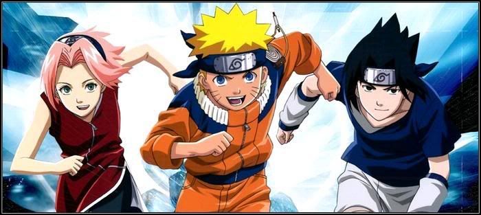
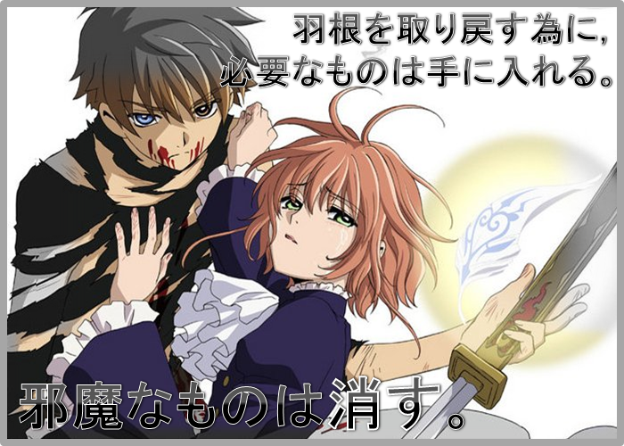
I spent quite some time yesterday designing up a new banner for my blog, as a tribute to Go!! (fourth opening of Naruto and my favorite Naruto opening) and to Team Shikamaru (composed of Naruto, Shikamaru, Neji, Chouji and Kiba, who are also the main characters of the Sasuke Retrieval arc, my favorite Naruto arc XD), so I thought I would blog about the process, haha.
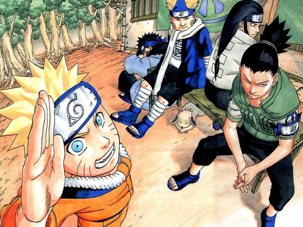
Firstly, have a look at this wallpaper that I started out with, depicting the five of them. On a irrelevant side note though, my computer desktop is now adorned by this wallpaper. XD
After cropping it to a suitable size for a blog banner, I decided to add some sort of logo, haha, with my blog name's "Pyromania" (don't think its full name of "Pyromania: RESERVoir CHRoNiCLE" is going to fit nicely in XD), and added "Fighting Dreamers" in as well, as some sort of name for the banner as well, haha. Oh, and I got that logo using this Bleach font generator, haha.
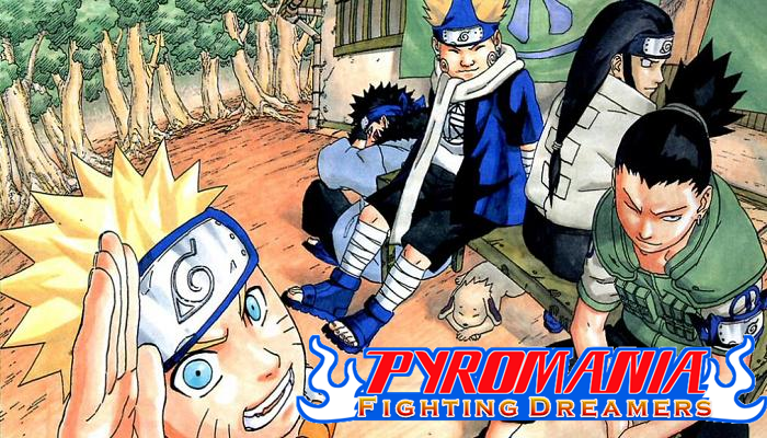
Though Kamel suggests that since this is a Naruto-theme banner, I should be using font from Naruto's logo, instead of Bleach, haha. He made a good point, so I gave it another shot using this Naruto font generator.
It looks rather ugly though, but I can't help it, since it was generated by a generator. This means that it is in picture form, not words form. So I gave it another shot, using WordArt, and this Naruto font I found on Google. Sucks that I had to do the colouring, shading and bordering myself though.
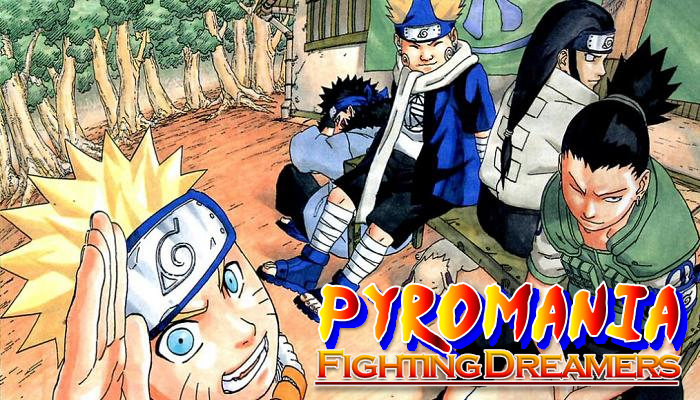
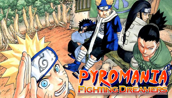
 This was the result.
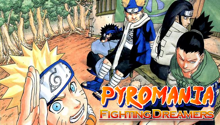
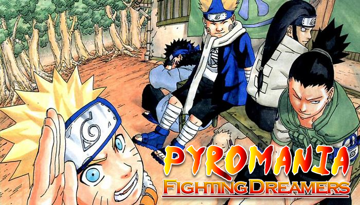
I thought it looks good enough already, but Kamel criticized it for not looking as good as the previous version, making me go "What the fuck? o.O". XD So after much comparison between the two versions, Kamel finally realized what is missing in the latter one, a fucking shadow. =.= So, lol, not like I should be complaining. I want a perfect banner for my blog.
 So I added the shadow, but the shadow functionality in Microsoft PowerPoint pissed me off. It's too rigid and fixed and not flexible enough, lol, so I just copied another of that, change the colour, make it 20% transparent, and call it "a shadow". :D
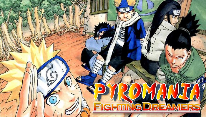
Apparently, Kamel still finds something to criticize, lol. He said the shadow's colour doesn't look like that in a Naruto logo, and I found that the position is a bit off too, so I edit it quite a bit.
Though, according to Kamel, the shadow's colour is still off. Not forgetting the font itself, the colour is also off. Oh bother.
Ignoring Kamel's further protests (God damn it, it's impossible to create exactly one with the exact same colour as the Naruto logo, and besides, this is a banner for my blog, not a volume cover for a Naruto manga =.=), I proceeded to add the border and the text. Japanese characters look rather weird in italics, lol.

But Sakura said she couldn't see the words, because the colours clashed with the trees behind. Since I wanted orange (orange for passion, y'know? XD), I thought maybe an increase in font size would work. I also thought of changing the outline colour, maybe that would prevent the colours from clashing.
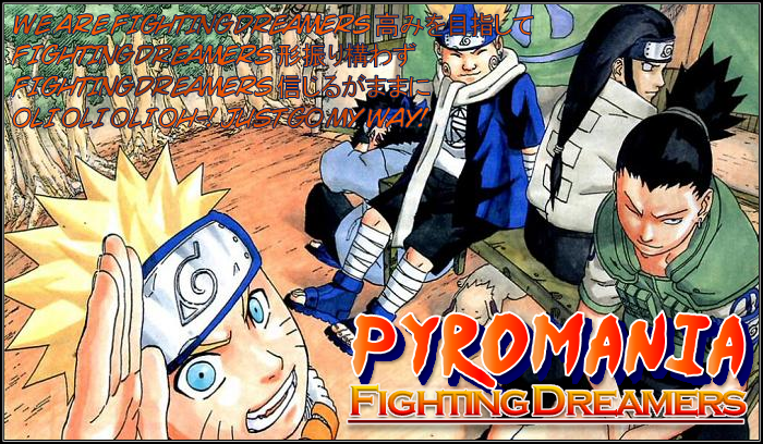
But apparently, the colours still clash. Does it really...? Oh well, I can't tell myself. Besides, what's important is that you can read the words, right? XD Also, Sakura said I shouldn't have the words covering "my character" (Chouji) up, so I had to change the font size back. Is that even a difference from before the font size change? Yeah, there is. The gradient in the font colour. ^^
She thought maybe blue would look better than orange, so I gave it a shot.

I thought it was quite nice, but apparently, everyone I asked told me orange looks nicer, lol, so orange it is. ^_^
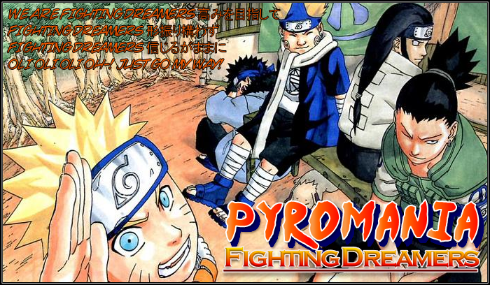
My blog banner at the end:
Oh, and come to think of it...
Samy [不用麻烦了,不用麻烦了。副歌不长,你们有几个一起上好了。正义呼唤我,美女需要我,英雄很忙的。] says:
Rate out of 10?
Kamel-Meh. says:
9
Kamel-Meh. says:
10 if it were one piece
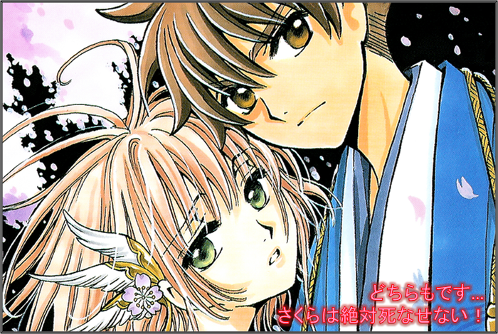
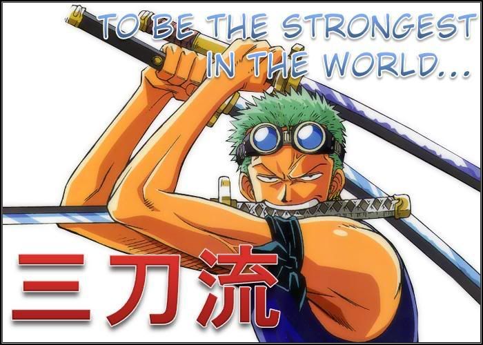
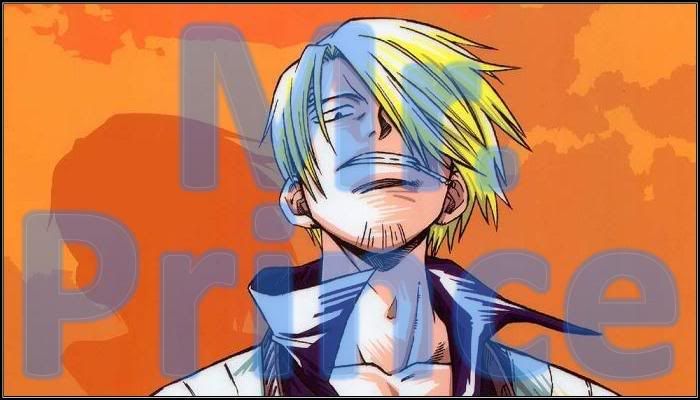
I haven't got a One Piece-theme blog banner yet, despite One Piece being my favorite manga, haha. XD Hmmm, I should do one for One Piece, maybe after I grow bored of my current Naruto one or something. XD

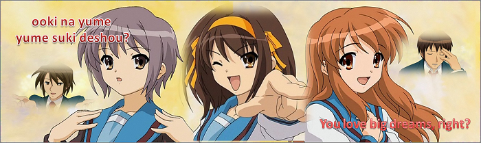
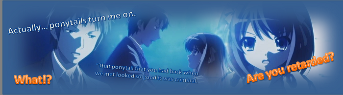
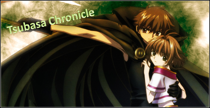
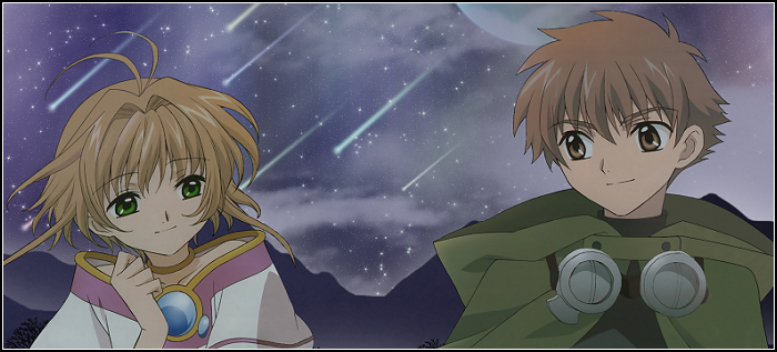
No comments:
Post a Comment